

Flame Graph
Flame Graph is where you actually find the hotspot: one service, one profile type, rendered as an interactive flame graph next to a sortable table of every function that showed up in the sample.
The toolbar
Section titled “The toolbar”- Profile type — switch between CPU, heap, goroutines, or whatever else this service reports, without leaving the page.
- Filter by label — add the same resource-attribute filters you’d set on Labels directly here.
- Highlight frames — type a function name and every matching frame gets an amber outline in the flame graph below, without changing what’s rendered.
- Split / Flamegraph / Table — choose whether you see the table and flame graph side by side, or either one full-width.
A mini time-series chart of the selected type sits above the main view, so you can see roughly where in the time range the samples are concentrated before you dig in.
The function table
Section titled “The function table”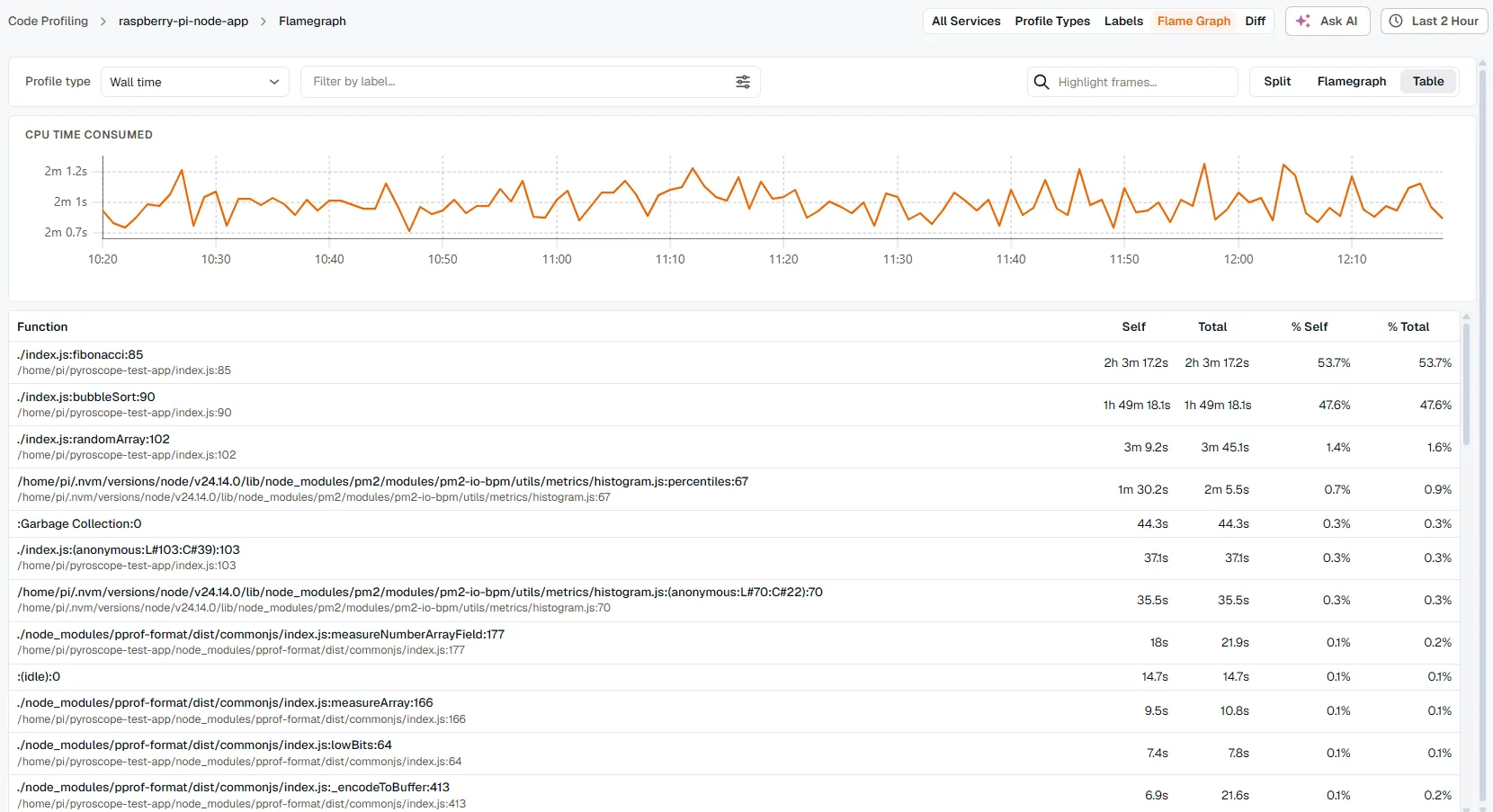
Every function that appears anywhere in the profile gets a row: name, file and line, self time, total time, and each as a percentage of the whole. Click any column header to sort by it — sorting by Self is usually the fastest way to find your hotspot, since it’s the time spent in that function, not in anything it calls.
Click a row to open its details.
The flame graph
Section titled “The flame graph”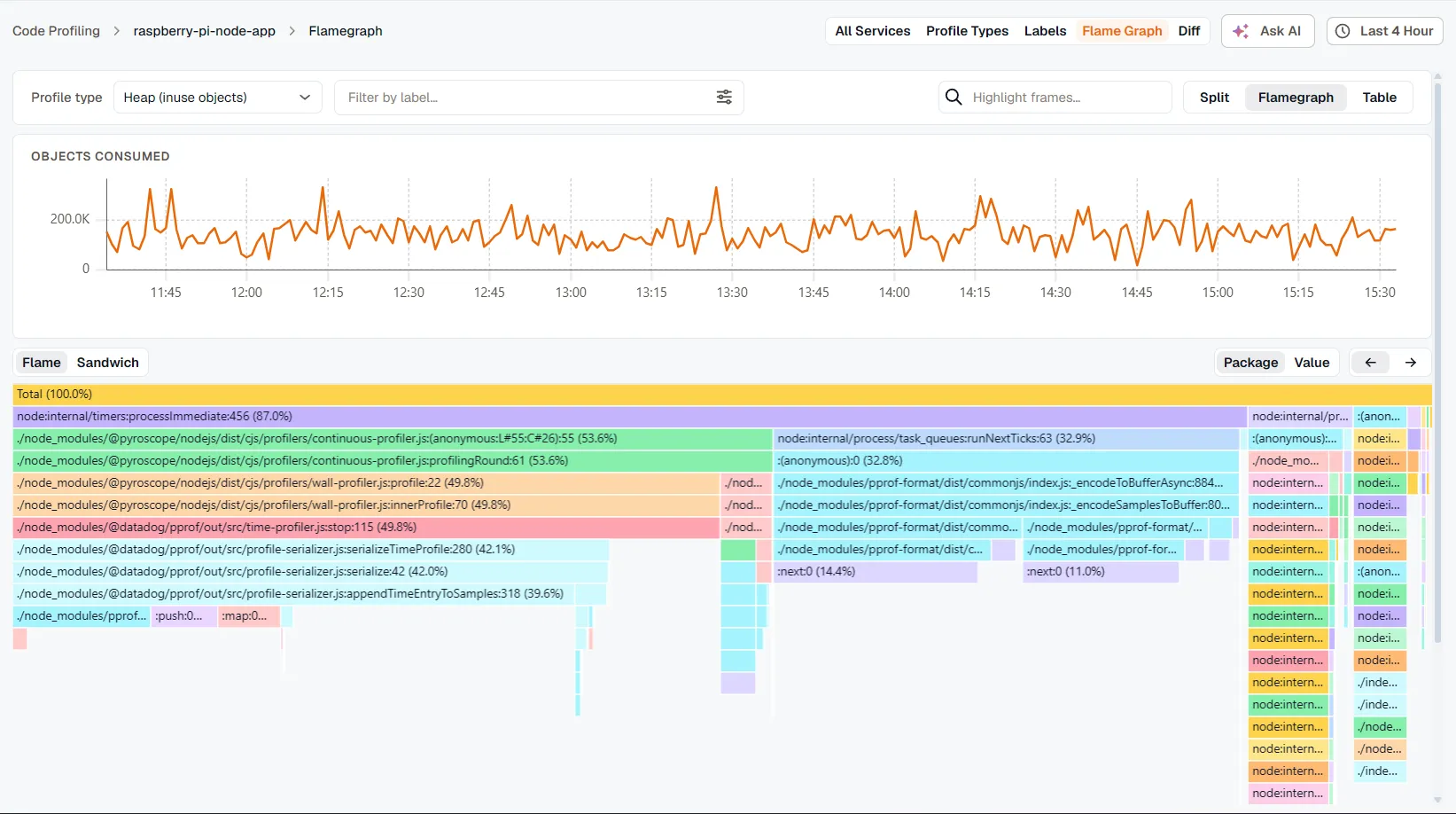
Each row of the flame graph is a stack frame; width represents time (or memory, for heap profiles) relative to the root. Wider means more expensive.
- Click a frame to zoom in — the flame graph re-scales to show only that frame’s subtree. A breadcrumb reading “N levels deep” appears, with ← Up and Reset to back out.
- Double-click anywhere to reset the zoom in one step.
- Sandwich mode flips the layout: pick a frame and see its callers stacked above it and its callees stacked below — useful when you already know which function is expensive and want to know who’s calling it, or what it’s calling that’s actually slow.
- Color by Package (the default) gives every package or namespace a stable color, so the same library looks the same everywhere you see it. Color by Value switches to a heat scale from cold (little self time) to hot (a lot), which is faster for spotting the single worst offender in a wide, unfamiliar graph.
- Hover any frame for its name, file and line, and total/self time with percentages.
Node details
Section titled “Node details”Clicking a frame or a table row opens a drawer with everything about that one function: its full name, file and line, detected language (inferred from the file extension or naming convention), and self/total time as both a raw value and a percentage of the whole profile.
Ask AI
Section titled “Ask AI”The Ask AI button, top right, hands the current view to the KloudMate Assistant: service, profile type, time range, and the top 10 functions by self time, pre-loaded into a prompt asking it to identify the bottleneck. It’s a starting point for the investigation, not a replacement for reading the flame graph yourself — see KloudMate Assistant for what it can and can’t do.
Related
Section titled “Related”- Labels — build the filters you can also set from this page’s toolbar.
- Difference View — compare two time windows instead of reading one snapshot.