

RUM Interface
The RUM interface is where you read the data your instrumented apps send. Start on Overview to see whether anything is wrong, then work down to the pages, releases, and individual sessions behind it.
To send data in the first place, see the Instrumentation Guide.
Pick an application first
Section titled “Pick an application first”Open Real User Monitoring to see every web, Android, and iOS application reporting to your workspace, then select one to open its tabs. An application is identified by its serviceName, which you set as applicationName when the SDK initializes.
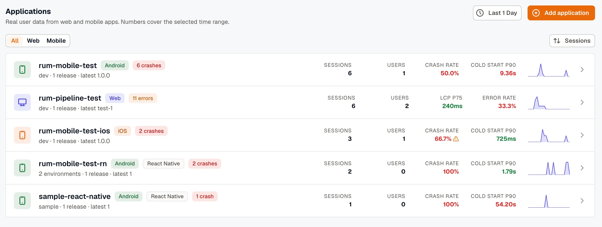
Each row carries the headline numbers for its platform: LCP P75 and Error Rate on web, Crash Rate and Cold Start P90 on mobile. Add application starts the setup flow described in the Instrumentation Guide.
Every platform gets the same tabs, but what’s inside them depends on the application. A browser app has Core Web Vitals and no crash rate. A native app has crashes, app hangs, and app-start timings, and Pages is titled Screens.
| Tab | What it shows |
|---|---|
| Overview | Whether anything needs attention right now |
| Sessions | What one visitor experienced |
| Pages | Which pages are slow or failing |
| Performance | What the app spends its time waiting on |
| Errors | What’s breaking, and how often |
| Releases | Whether the last release made things worse |
| Journeys | Where people go, and where they give up |
| Events | What your custom events are doing |
Overview
Section titled “Overview”Start on Overview to find out whether anything needs attention right now.
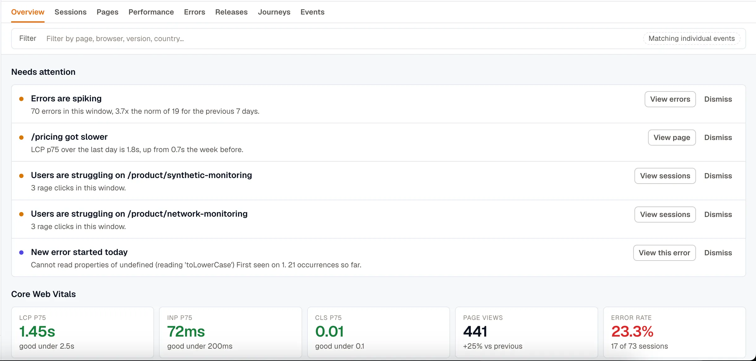
- Needs attention lists what changed, with the evidence behind each finding:
70 errors in this window, 3.7x the norm of 19 for the previous 7 days. - Core Web Vitals reports LCP, INP, and CLS at p75 with the boundary each is judged against, plus page views and error rate. Web applications only.
- Release health reports the crash-free rate, on applications that can crash.
- Volume and failures plots sessions, page views, and errors over the range.
- Worst pages by impact, Recent errors, and Delivery each link through to the tab they come from.
- Audience breaks sessions down by browser or device, version, Screen resolution, and country. Counts are distinct sessions, so a long session that fired a thousand spans still counts once.

Core Web Vitals thresholds
Section titled “Core Web Vitals thresholds”The vitals panels are colored to Google’s own boundaries, so a red panel means the same thing here as it does in Lighthouse or Search Console.
| Metric | Good | Needs improvement | Poor |
|---|---|---|---|
| LCP (Largest Contentful Paint) | ≤ 2.5s | 2.5s to 4.0s | > 4.0s |
| INP (Interaction to Next Paint) | ≤ 200ms | 200ms to 500ms | > 500ms |
| CLS (Cumulative Layout Shift) | ≤ 0.1 | 0.1 to 0.25 | > 0.25 |
INP replaced First Input Delay as a Core Web Vital in March 2024, and the RUM views report it instead.
Sessions
Section titled “Sessions”Sessions lists individual visits, most recent first.
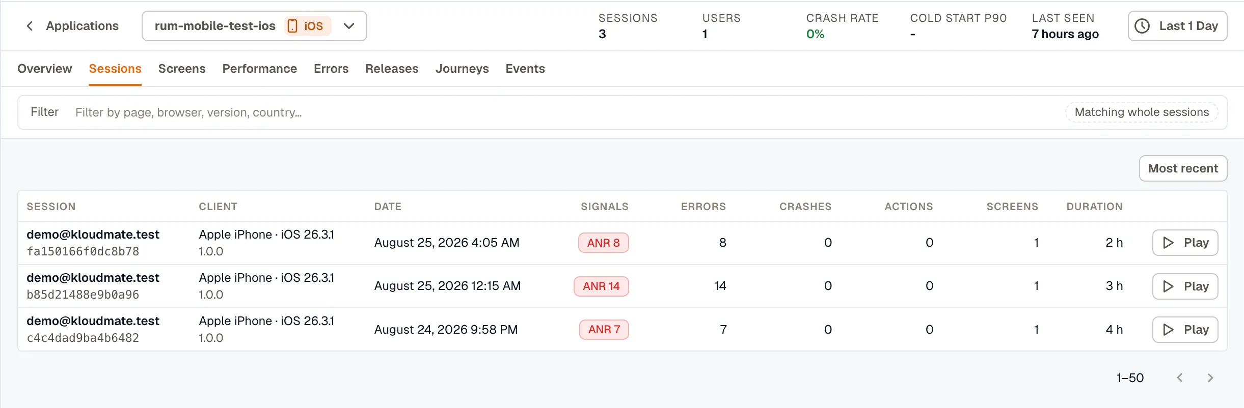
Signals badges the crashes, ANRs, and frustration clicks in each session, worst first and with counts, so you can tell which sessions are worth opening without opening them. See Frustration signals.
Play is disabled on sessions with no recording, which is most of them. See Record sessions for replay.
Click any row to open the session. See Session Detail for what is inside.
Pages ranks the pages of a web app, or the screens of a mobile app, by how fast they load and how often they fail.
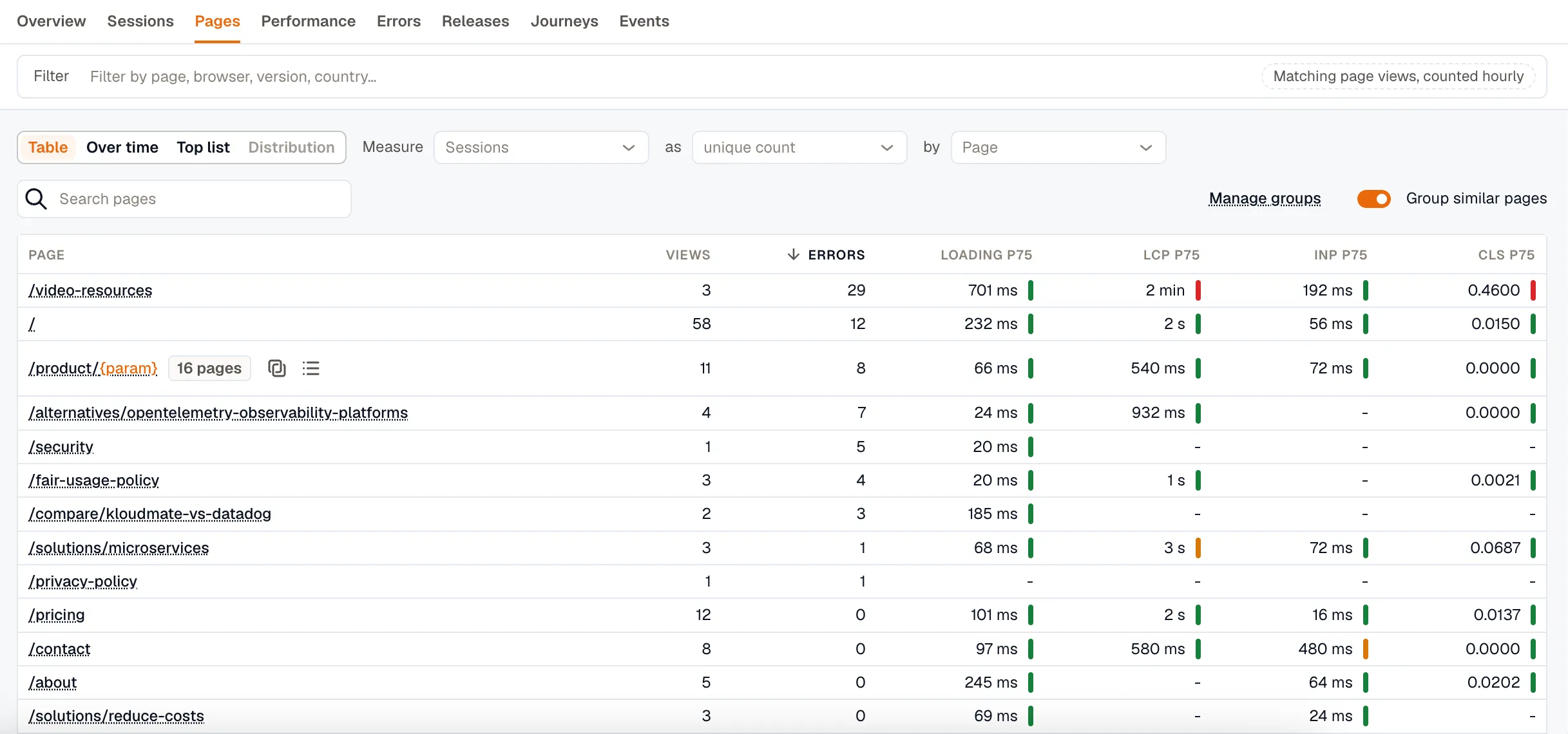
Each row carries a page’s views and errors, plus its load time, LCP, INP, and CLS at p75, banded good, needs-improvement, or poor. Sort by any column to bring the worst to the top, then open a page to see its own trend and the errors on it.
Group similar pages collapses parameterized URLs, so /orders/1041 and /orders/1042 become one /orders/{param} row instead of thousands. Use Manage groups to save a grouping rule for the whole workspace. Mobile screens are class names rather than paths, so grouping is web only.
Page views that arrived without a page name are collected into an Unattributed row below the table.
Performance
Section titled “Performance”Performance covers what the application spends its time waiting on. Every panel links through to the sessions behind the number.
On web it opens with Core Web Vitals, the same measures Overview reports, at Google’s 75th percentile. TTFB P75 appears here too, with the number of samples behind it.
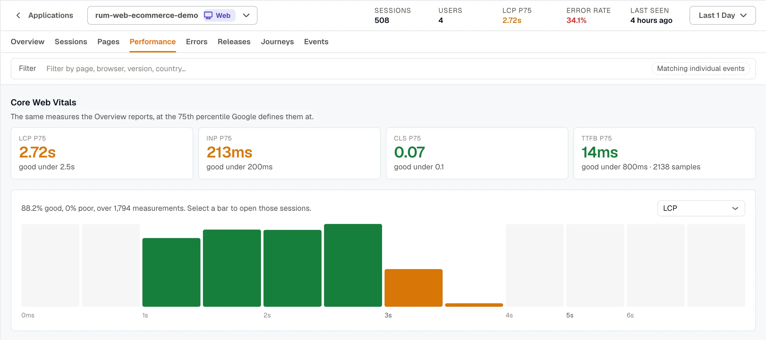
The distribution below the cards splits one measure into buckets, banded by Google’s boundaries. A p75 on its own can’t tell you whether a handful of visitors had a terrible experience or everyone had a mediocre one. The distribution can, and selecting a bar opens the sessions inside that bucket.
- Slowest pages by impact ranks pages by the total load time each one contributes, so a busy page that is slightly slow outranks a rarely visited page that is much slower. Pages ranks by the measurement itself, which is a different question.
- Who is slow breaks a measure down by browser, device, OS, or country, compared against the application’s own percentile.
- Long tasks counts only the time past the 50 ms threshold rather than the full duration of each task, so a page with many 55 ms tasks doesn’t outrank a page that blocked for two seconds.
Network covers the application’s own fetch and XHR calls.
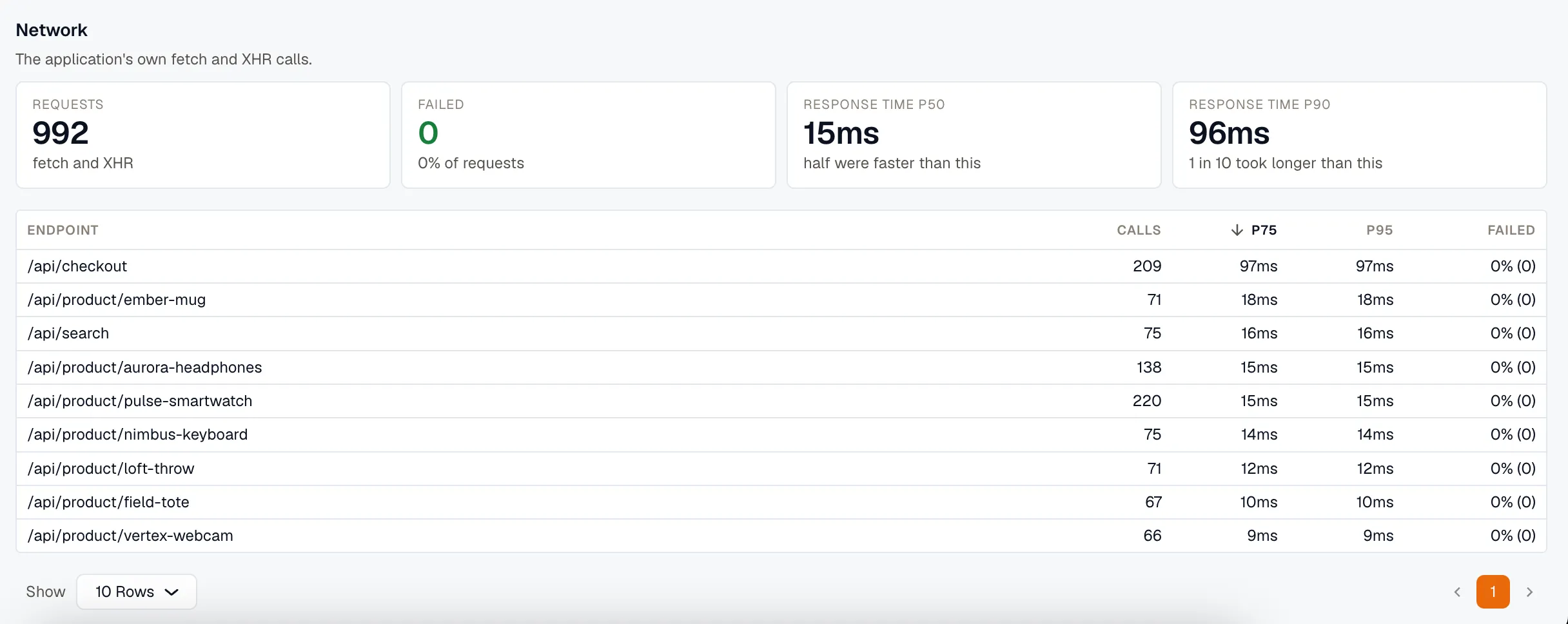
The endpoints table puts latency and failure rate on the same row, grouped without the query string so that one route is one row. A Resources section appears as well if the application sends browser resource timing. Panels with no data behind them aren’t drawn at all.
On Android and iOS the tab has App start, Screen loads, Who is slow, Rendering, and the same Network section. Cold start and TTFD measure different things. Cold start covers the launch itself, while time to fully drawn runs until the first screen is usable, so it’s the larger of the two.
Errors
Section titled “Errors”Errors lists every error, crash, and app hang your SDKs reported, with a facet rail for narrowing the list and a volume chart above it.
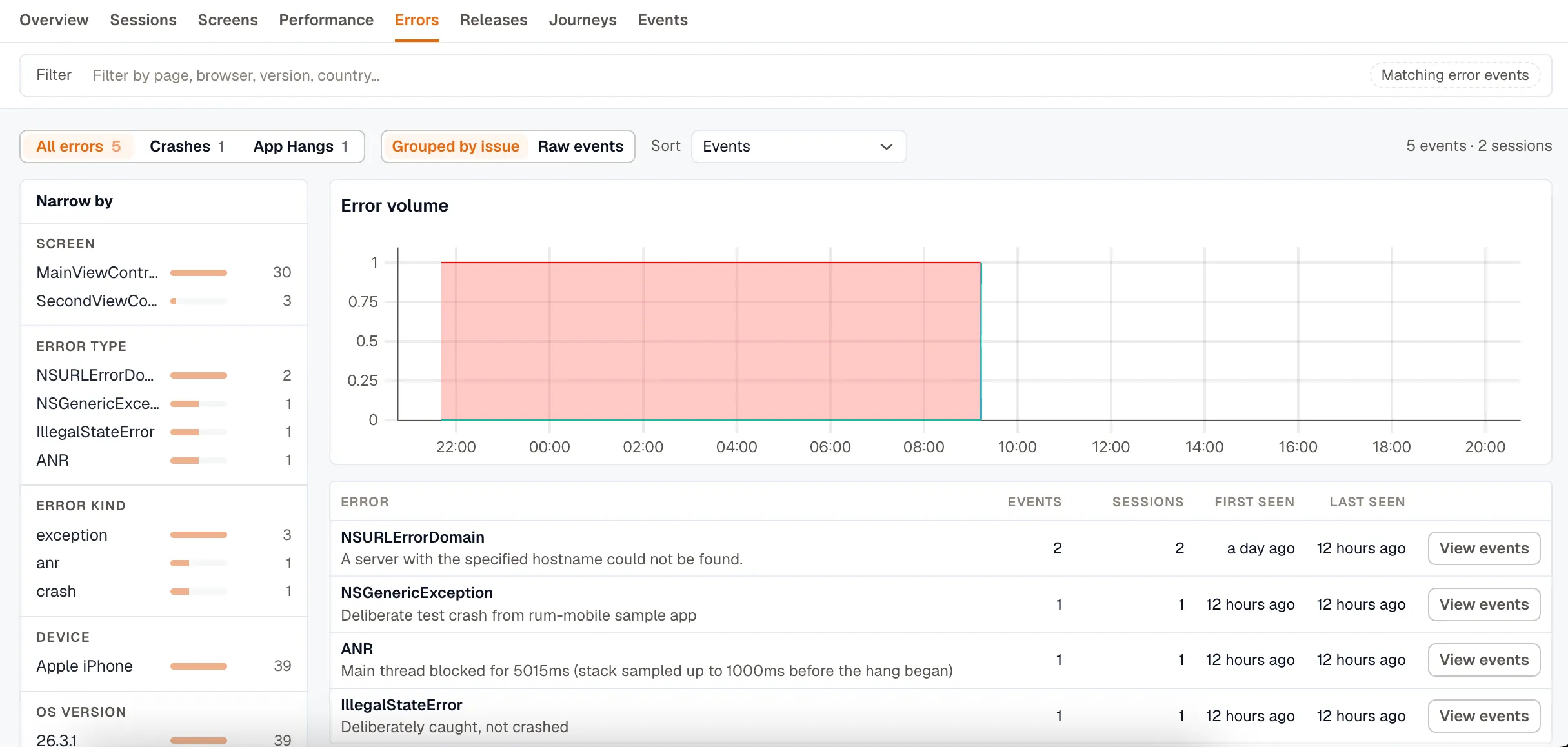
All errors, Crashes, and App Hangs split the list by kind, with ANRs in place of App Hangs on Android. Grouped by issue collapses identical errors into a single row with its count and its first and last occurrence. Switch to Raw events when you’re chasing one specific failure rather than a pattern.
Opening an error shows its stack trace, its attributes, and the sessions it happened in.
Releases
Section titled “Releases”Releases shows what changed when the current version shipped. It opens on that version against the one it replaced, and Compare swaps in any other pair.
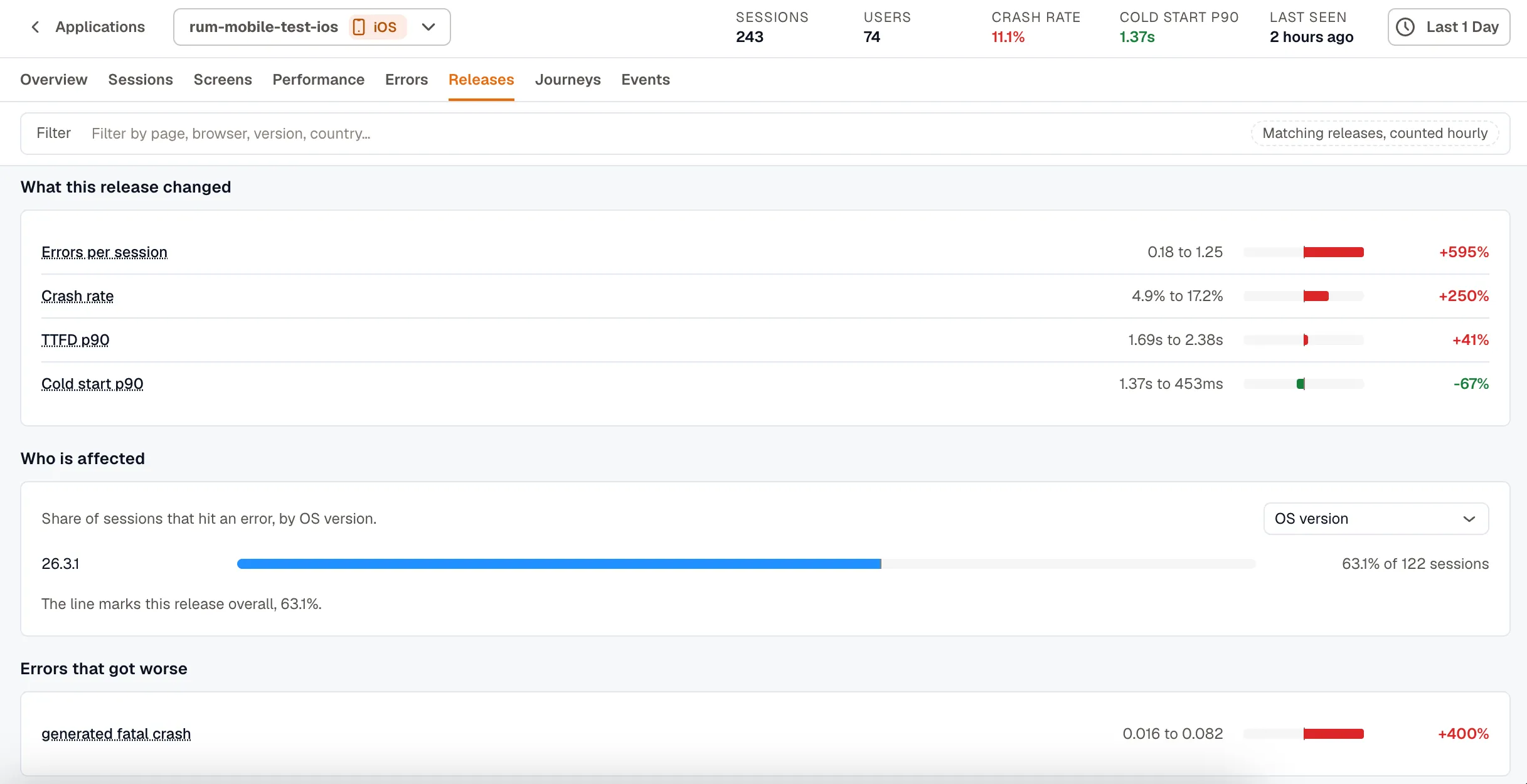
- What this release changed gives each measure as before, after, and the change:
0.18 to 1.25errors per session,+595%. - Who is affected breaks the share of sessions that hit an error down by browser, OS version, device, or country. It measures how likely a session on that browser is to fail, which is not the same as how many people use it.
- Errors that got worse ranks regressions by per-session rate rather than by raw count, because a release partway through its rollout has lower counts for everything. New in <version> picks out the error signatures that didn’t exist before.
- Adoption, Sessions by version, and Version history cover the rollout itself.
Every number on the tab opens the rows behind it, scoped to that version.
Release data is counted hourly and kept for 180 days. You can still compare 4.2 against 4.1 weeks later, after the raw sessions behind both have aged out. A release that hasn’t collected enough sessions yet isn’t compared at all.
The older /rum/deployments URL redirects here.
Journeys
Section titled “Journeys”Journeys shows the routes people take through the app and where they stop. Both views work on one application at a time, so set an Application filter first. Without it you get two unrelated graphs drawn on top of each other.
Pathways
Section titled “Pathways”Pathways draws the routes visitors actually took, as a left-to-right graph. Each node names a page with its session count and its exit rate, and each edge carries the number of sessions that took it.
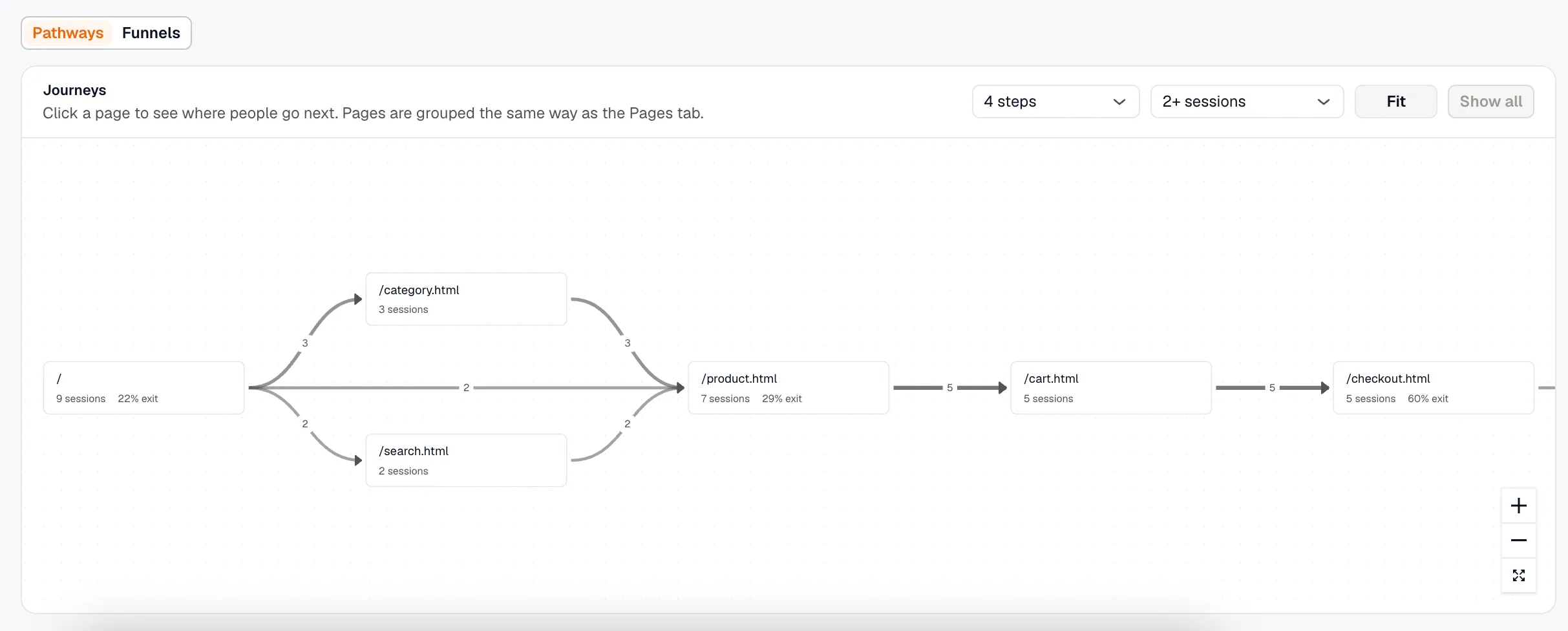
Click a page to redraw the graph starting from it. You can also set how many steps forward it follows, and how many sessions a path needs before it’s drawn at all. Pages are grouped the same way as on the Pages tab.
Clicking a node opens its Sessions, along with the share who Left here and the share who Hit an error. A high Left here in the middle of a path is where people are giving up.
Funnels
Section titled “Funnels”Funnels measure conversion across up to five steps. A step is either a route, such as /cart, or an Event, such as checkout_completed, and either can match a prefix.
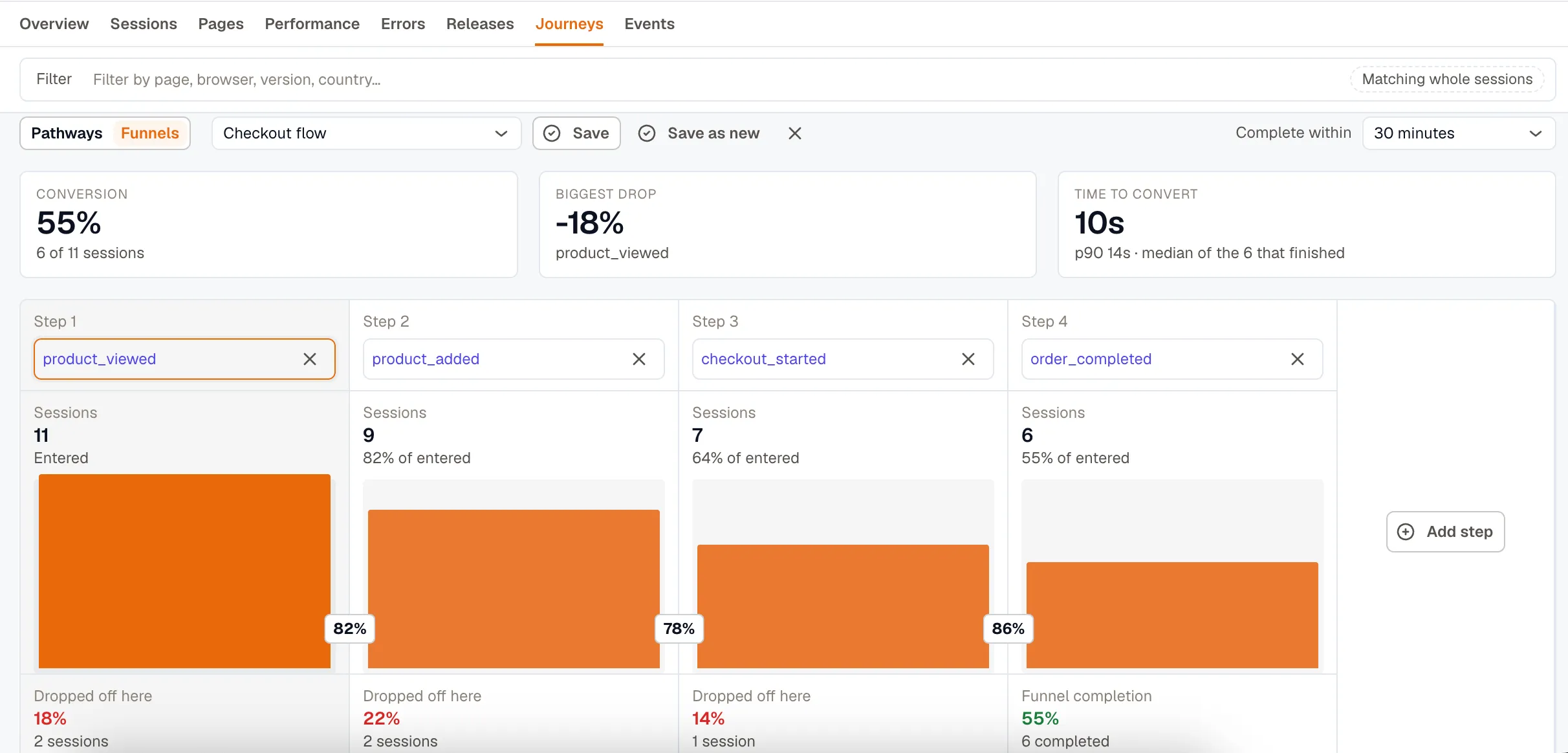
Conversion, Biggest drop, and Time to convert sit above the chart, and each step reports its session count and how many people dropped off there.
Complete within sets how long a session has to get from the first step to the last. Steps further apart than that don’t count as a conversion. Compare to previous period reports the change in percentage points against the preceding window.
Clicking a step opens the sessions that stalled there, with the errors they hit and a Play button on every row. Save a funnel to track its conversion over time.
Events
Section titled “Events”Events covers everything sent through addEvent(). The same events are presented in separate views:
- Analyze is the default. Pick a measure, an aggregation, and something to group by, then render it as a table, over time, a top list, or a distribution.
- Raw events lists individual events with their payloads. Use it when you want to see exactly what one session sent.
- Totals reads an hourly rollup that is kept for 400 days, so it’s the only view that reaches back further than raw retention. The rollup doesn’t carry payload attributes.
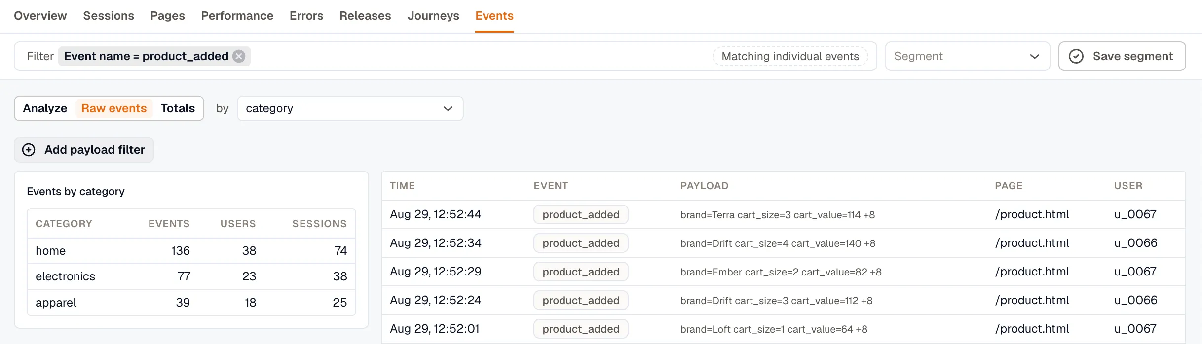
Custom events are counted per session and per user, and can be used as funnel steps. Event names past the workspace’s daily limit are collected under Over the daily name limit, which usually means a value was interpolated into the name. See Keep the event name constant.
Group by a payload attribute
Section titled “Group by a payload attribute”You can group by any attribute your application sends in the event payload, in both Analyze and Raw events. If you send an attribute as a number, it is grouped as a number.
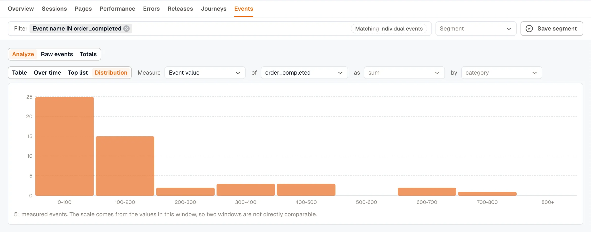
For example, to chart revenue by category over time, select Event value as the measure, sum as the aggregation, and group by category.
Over time charts the 50 largest groups. If you group by an attribute with thousands of distinct values, such as a user ID, most of them won’t appear on the chart.
A payload key only exists in the time ranges where your application actually sent it. If you group by a key that isn’t present in the selected range, the grouping falls back to event name.
A group with no value
Section titled “A group with no value”Events that were sent without the attribute are collected into a single group. When you group by category, that group appears as No category, and it’s often the largest group on the tab.
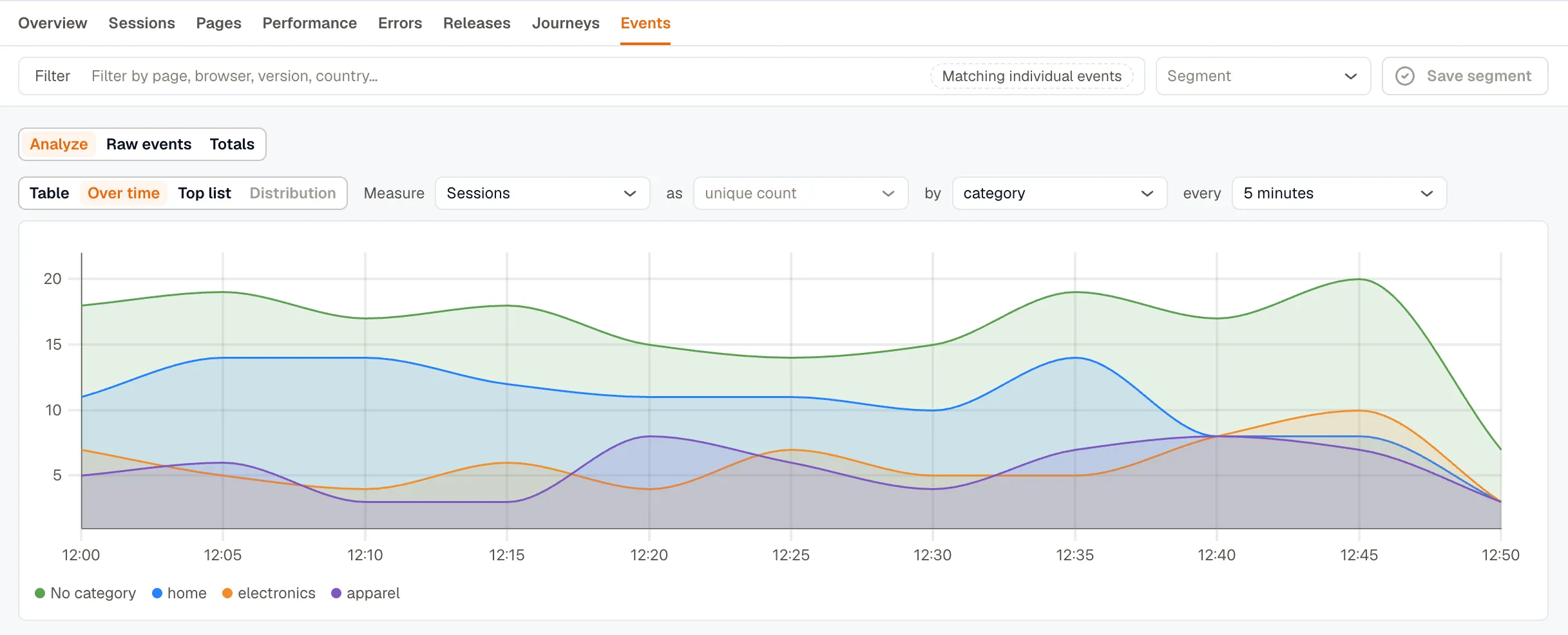
This group doesn’t tell you anything about your categories. It tells you how many events were sent without the attribute at all, so it’s really a measure of missing instrumentation.
Exclude removes those events from every panel on the tab, which lets you compare the real categories against each other.
Numeric attributes behave differently. A missing number comes back as 0, so you can’t distinguish it from a genuine zero, and there’s no separate group to exclude.
What a distribution needs
Section titled “What a distribution needs”Distribution works on Event value only, one event at a time. The other measures are counts, and a count has no spread. Only events that carry a value can be charted this way.
Filter the data
Section titled “Filter the data”The Filter bar lets you narrow down the data across the different tabs using things like page, browser, version, country, and more.
When you select multiple values for the same field, the filter matches any of those values. For example, selecting Chrome and Firefox includes data from either browser.
The meaning of a filter depends on the tab you’re using, and the filter bar tells you what it is matching:
- Sessions and Journeys: Matching whole sessions
- Errors: Matching error events
- Pages: Matching page views, counted hourly
This distinction matters. A page filter on Sessions finds sessions that visited /checkout, while the same filter on Errors finds errors that occurred on /checkout.
Not every filter is applicable to every tab. For example, a route filter doesn’t apply to Journeys because Journeys match entire sessions. If a session visited one page in a journey, the other pages in that journey are already part of the session.
When a filter can’t be applied to the current tab, it is shown as struck through with an explanation. It is also excluded from the query rather than being silently ignored.
Filter on a payload attribute
Section titled “Filter on a payload attribute”You can filter events using any attribute included in the event payload. Numeric attributes support comparison operators such as >, >=, <, and <=. For example, cart_size > 2 matches events where cart_size is greater than 2.
Payload attribute filters are available on some tabs only:
- Events and Journeys support payload filters. In a funnel, for example,
cart_value > 100selects sessions that emitted at least one matching event. Earlier funnel steps are still included for those sessions. - Sessions supports text attributes only. Numeric attributes such as
cart_sizecannot be used as session filters. - Errors, Pages, and Releases don’t support payload filters because errors, page views, and releases don’t contain event payload attributes.
Save a filter set as a segment
Section titled “Save a filter set as a segment”If you use the same set of filters regularly, you can save them as a segment and apply them later from any tab. A segment belongs to a single application.
You can update a segment while it’s applied, or save the current filters as a new segment. Only the person who created a segment can delete it.
Applying a segment replaces the filters currently selected, while keeping the selected application unchanged.