APM and Services
Open APM & Services to compare application and service performance at a glance. It opens in the List view. Select the Service map view to see how your services connect, as described in Service Map.
Services Overview
Section titled “Services Overview”The List view shows all instrumented applications and services in a table, so you can compare their health across the selected time range.
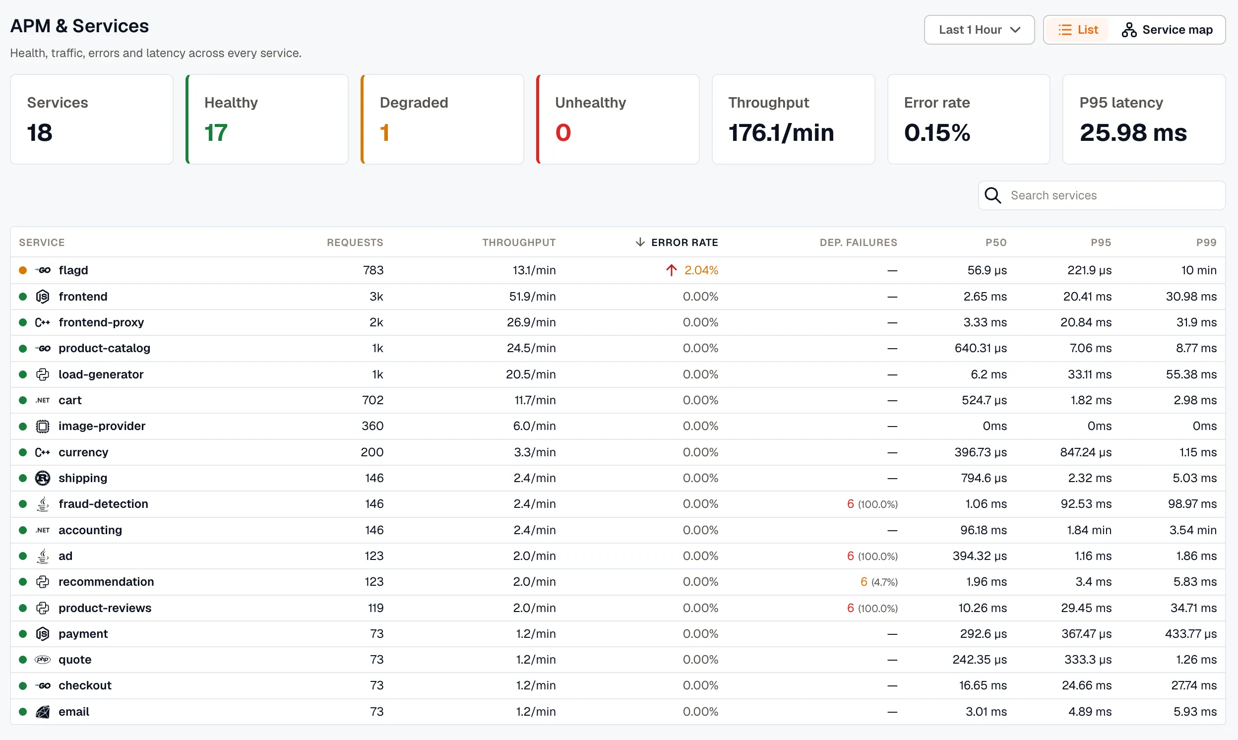
Each row represents one service and includes:
- Service: the application or service name
- Requests: total requests handled during the selected time range
- Throughput: request rate, such as requests per minute
- P99, P95, and P50 latency: percentile-based latency views for worst-case, upper-percentile, and median performance
- Error rate: percentage of failed requests
- Dep. failures: outbound calls this service made that failed, with their share of all its outbound calls. These failures don’t count toward Error rate.
Service APM Dashboard
Section titled “Service APM Dashboard”Clicking any service in the List view opens its APM dashboard, which is a preconfigured view focused on that specific service.
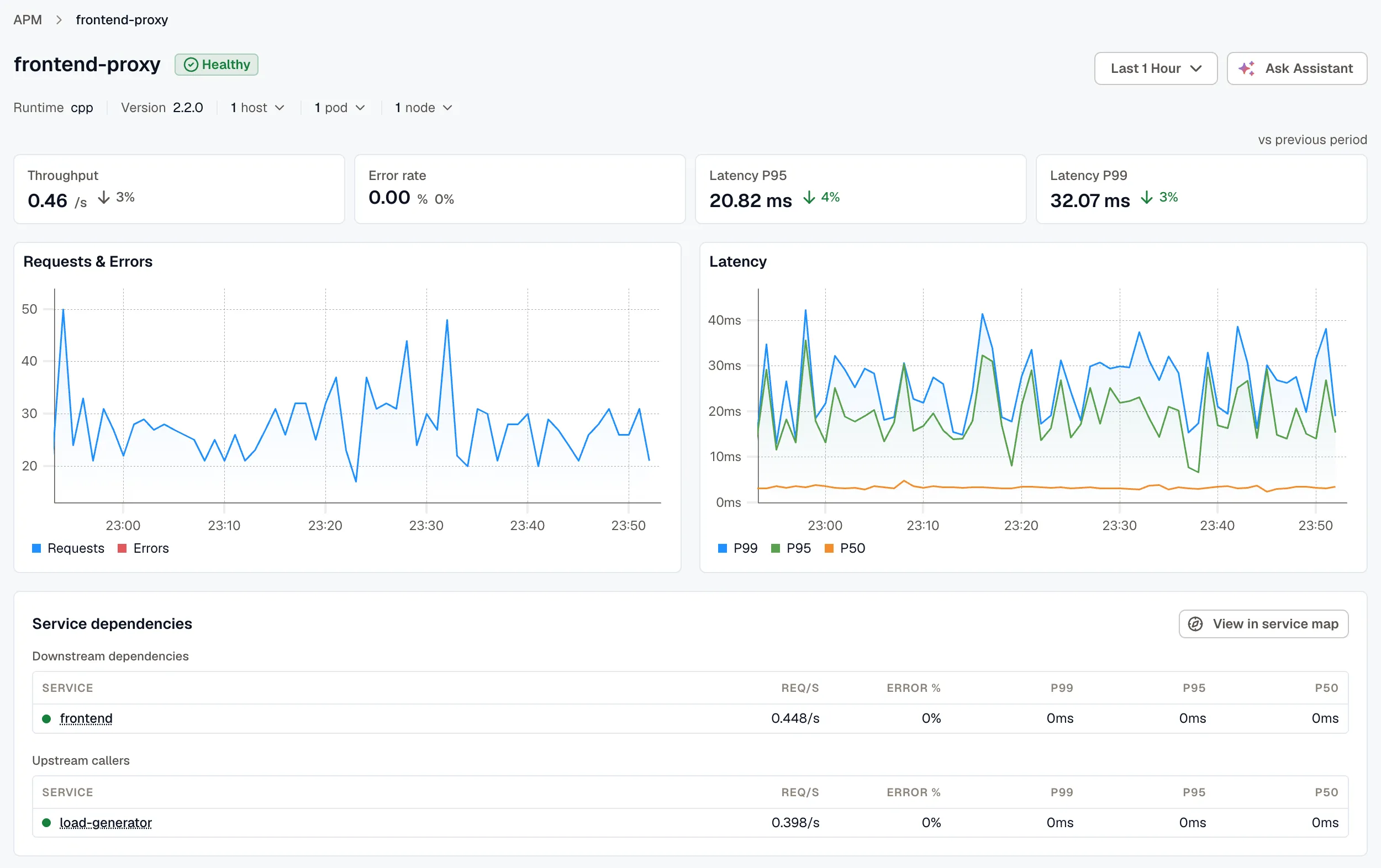
The dashboard includes:
- Requests, errors, and latency over time: timeline charts that help identify traffic spikes, error bursts, and latency regressions
- Service dependencies: tables of downstream dependencies, outbound calls, and upstream callers, including request rate, error percentage, and latency
- Related issues, alerts, and dashboards: links to broader operational context for that service
Traces and Logs
Section titled “Traces and Logs”From the APM dashboard, you can inspect related traces and logs for a selected service.
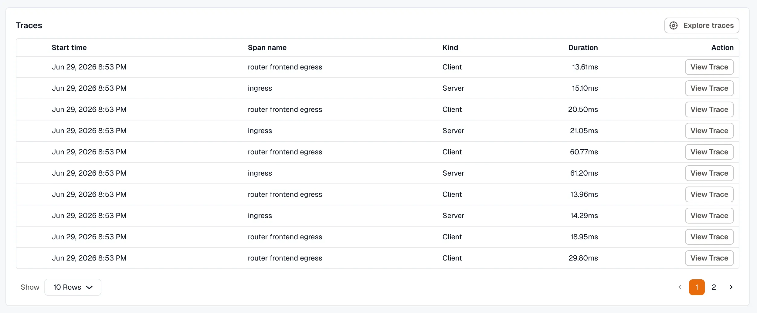
The Traces table shows recent traces with details such as start time, span name, kind, duration, and a link to the full trace for end-to-end request analysis.
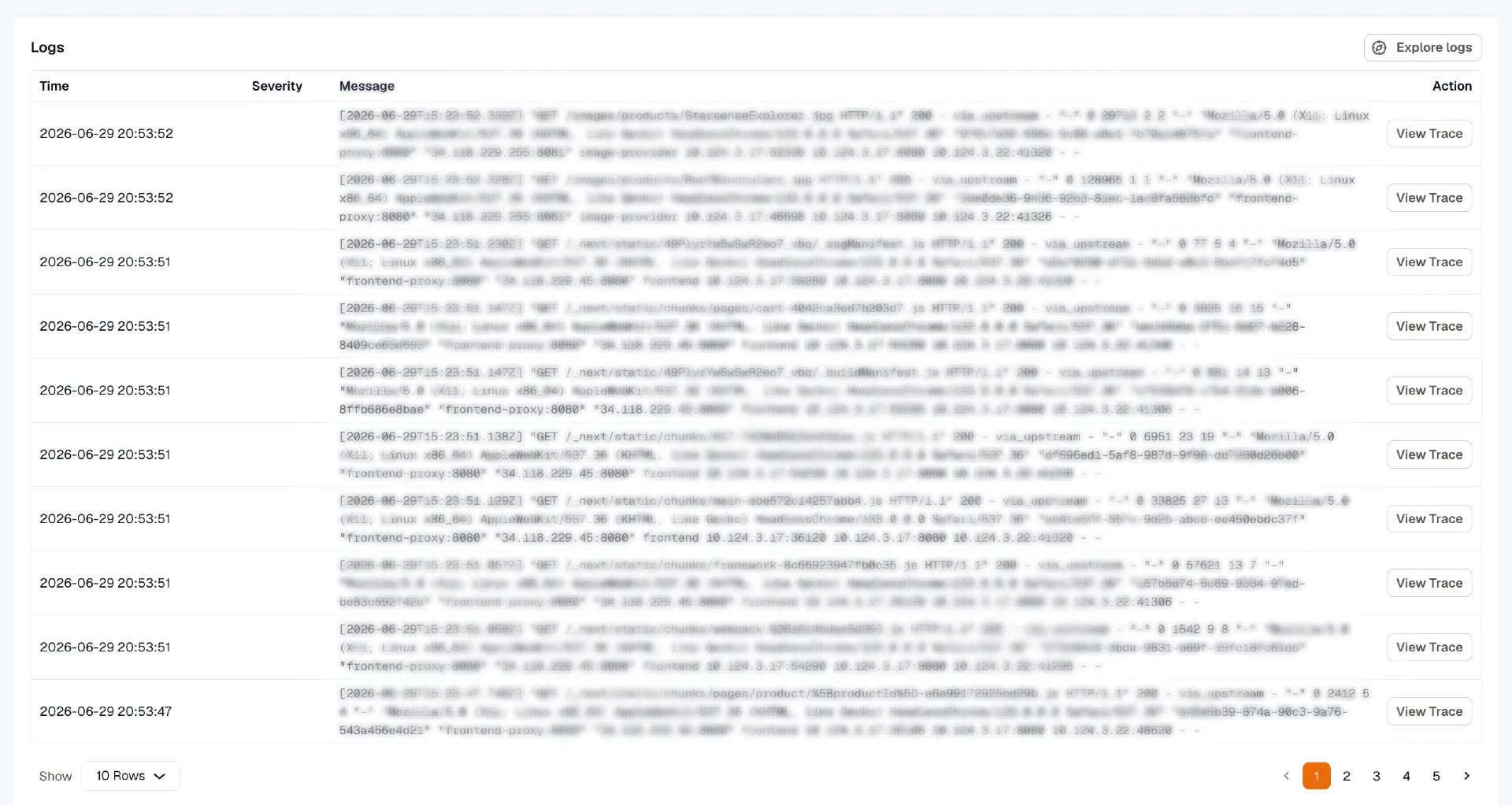
The Logs table lists recent logs with time, severity, and message, along with actions to explore logs in detail and correlate them with traces and issues for faster root-cause investigation.