

Pie Chart Panel
The Pie Chart Panel displays data as a pie or donut chart, making it easy to visualize the proportional breakdown of values across categories. It includes a query box to define the data you want to visualize, and a set of settings to customize how that data is presented.
When the panel type is set to Pie Chart, the following settings are available under the General tab:
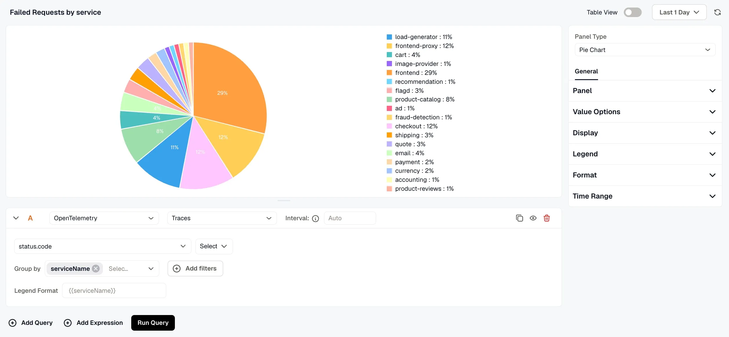
- Name: Enter a name for your panel. This appears as the panel title on the dashboard.
- Description: Enter a description to provide additional context about what the panel displays.
- Links: Click Add link to connect the panel to related resources, such as a runbook or an external dashboard.
- Repeat options: Set Repeat by variable to render one copy of this panel for each value of the selected variable. Only the first 20 values are used, and the copies show on the dashboard, not in this editor.
Value Options
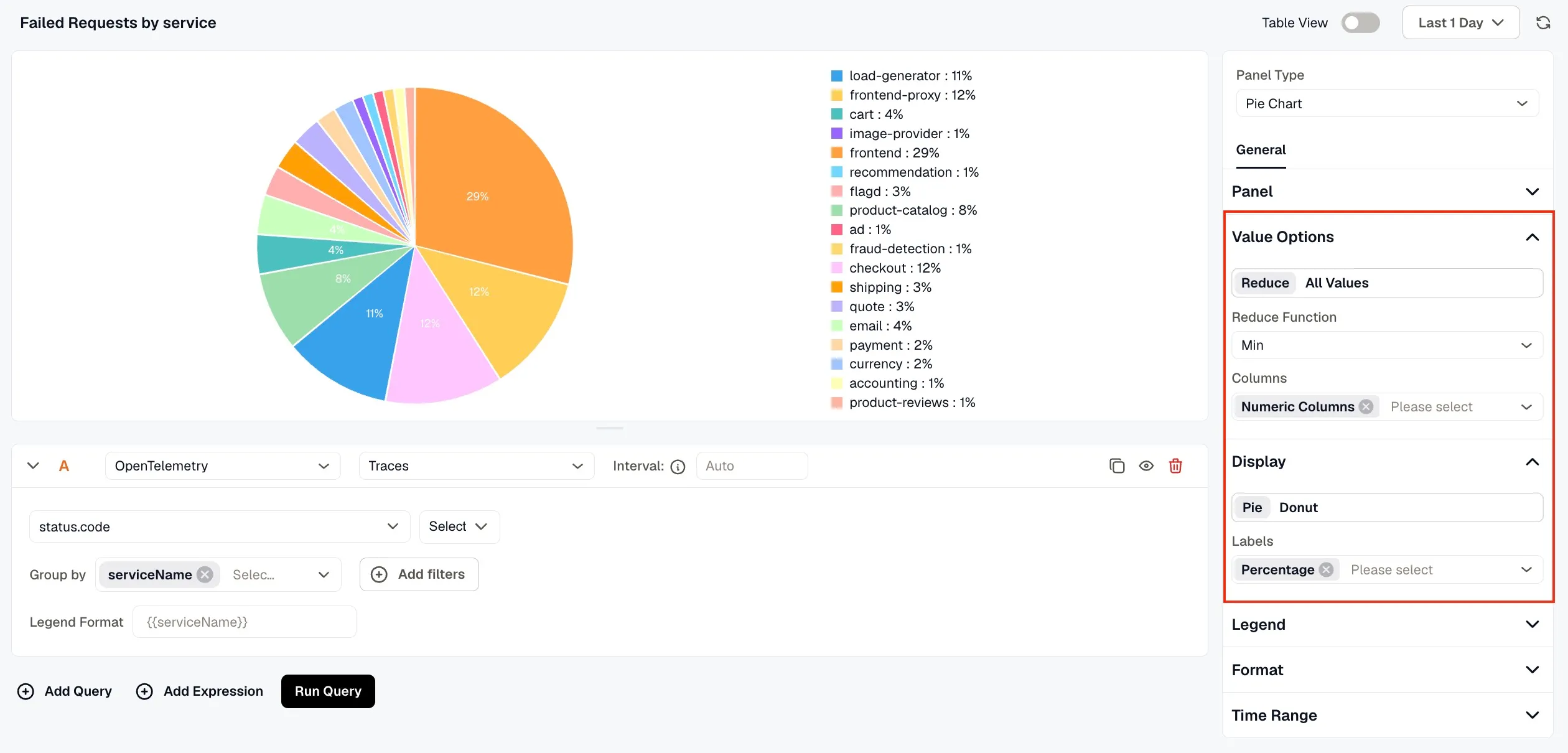
Section titled “Value Options”Configure how values from your query are calculated and represented in the chart.
- Reduce: Aggregates all data points for each series into a single value using a Reduce Function (such as Min, Max, Mean, or Total). Use the Columns option to specify which columns are included in the calculation.
- All Values: Displays every individual data point in the chart without aggregation.
Display
Section titled “Display”Choose between Pie and Donut as the chart style. Use the Labels setting to control what is shown on the chart slices, including Value, Percentage, and Name.
Legend
Section titled “Legend”Toggle the legend on or off using the Show legend option. When enabled, choose between List or Table mode, set the placement to Right or Bottom , and use the Legend Values dropdown to select what is shown alongside each legend entry, such as Percentage.
Format
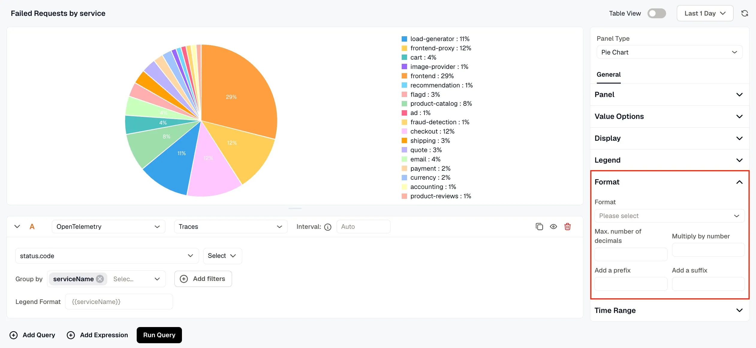
Section titled “Format”Use the Format dropdown to choose how values are displayed. Available options include Number, Bytes (SI), Bytes (IEC), Percentage, Duration (Milliseconds), Duration (Nanoseconds), and Unformatted. You can also set the maximum number of decimal places, multiply values by a number, and add a prefix or suffix.
Time Range
Section titled “Time Range”Configure time range behavior for this panel independently from the dashboard.
- Override Dashboard Time Range: Individual panels can use their own time range configuration. Enable this to override the time range set at the dashboard level.
- Time Shift: Shift the panel’s start and end time by a specified time shift expression. Use the minus (
-) operator to subtract time, with the same units supported by the dashboard time range expressions.
Refer to Time Range Expressions and Settings for supported units and syntax.