

Histogram Panel
The Histogram Panel shows how numerical data is distributed over the selected time range. It groups values into buckets and counts how many fall into each one — each bar is a bucket, its height is the count, and the x-axis is the bucket range.
Use it to visualize request durations, error rates, or latency distributions, and switch time ranges to see how the distribution shifts after a deployment or a traffic spike.
When the panel type is set to Histogram, the following settings are available under the General tab:
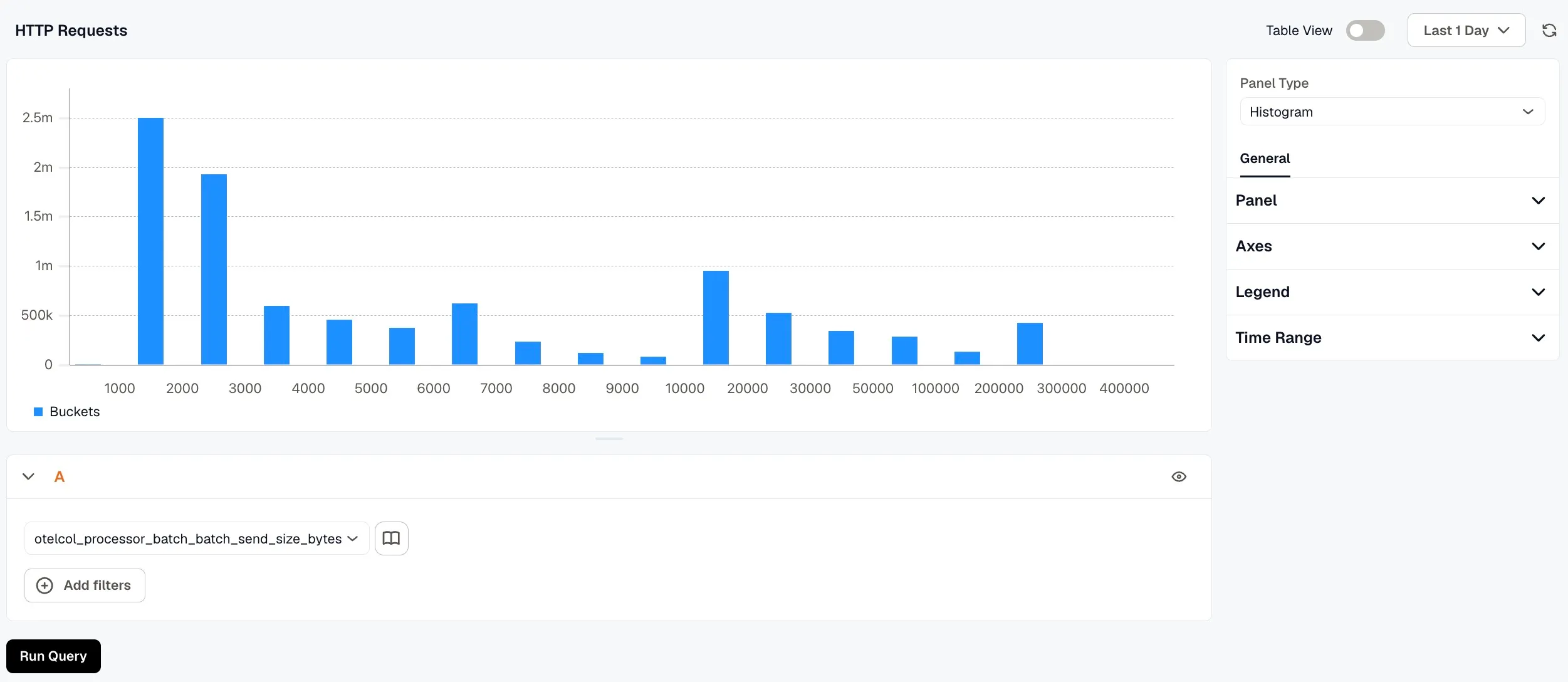
- Name: Enter a name for your panel. This appears as the panel title on the dashboard.
- Description: Enter a description to provide additional context about what the panel displays.
- Links: Click Add link to connect the panel to related resources, such as a runbook or an external dashboard.
- Repeat options: Set Repeat by variable to render one copy of this panel for each value of the selected variable. Only the first 20 values are used, and the copies show on the dashboard, not in this editor.
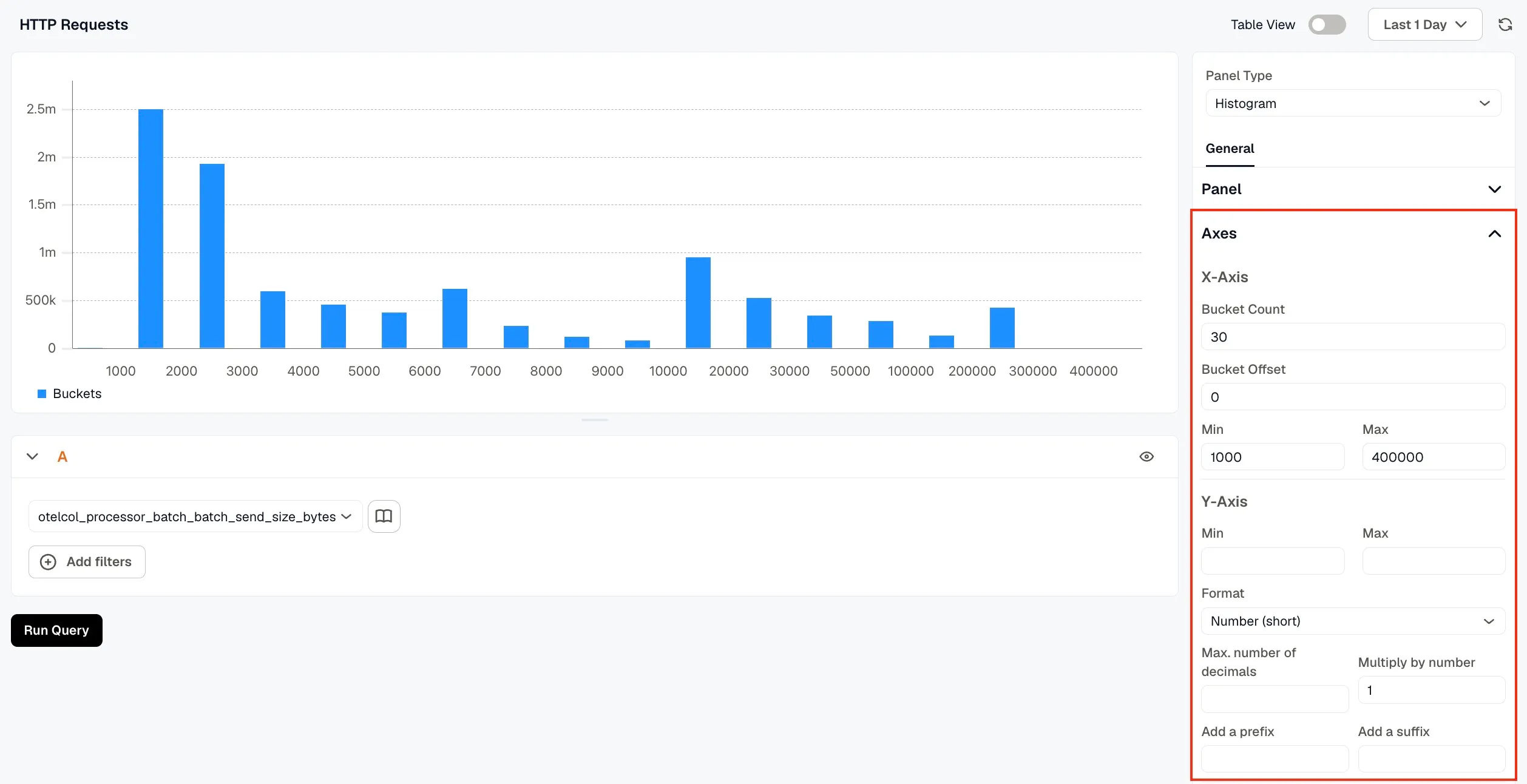
The Axes section provides controls to adjust how the distribution is visualized after data is fetched.
- Bucket Count (default: 30): Controls how many buckets the data is grouped into. Reducing the bucket count gives a more aggregated view; increasing it reveals finer granularity.
- Bucket Offset: Shifts all bucket ranges by a fixed value. For example, an offset of +10 transforms a bucket range of [x, y] to [x+10, y+10]. This is useful when you want to align bucket boundaries with a specific baseline.
- Min / Max: Constrains the visible range by discarding buckets that fall outside the specified bounds. Use this to focus on the meaningful portion of the distribution and filter out extreme values or noise.
The Y-Axis controls the count scale: set Min and Max to fix the range instead of scaling automatically, and use Format, decimals, and a prefix or suffix to control how the numbers are displayed.
Legend
Section titled “Legend”Choose between Table or List mode to control how the legend is displayed. Use the Values selector to choose which aggregate values (such as Min, Max, or Mean) appear alongside each series label. Leave Values empty to display labels only.
Time Range
Section titled “Time Range”Configure time range behavior for this panel independently from the dashboard.
- Override Dashboard Time Range: Individual panels can use their own time range configuration. Enable this to override the time range set at the dashboard level.
- Time Shift: Shift the panel’s start and end time by a specified time shift expression. Use the minus (
-) operator to subtract time, with the same units supported by the dashboard time range expressions.
Refer to Time Range Expressions and Settings for supported units and syntax.